


Photo by rbrwr
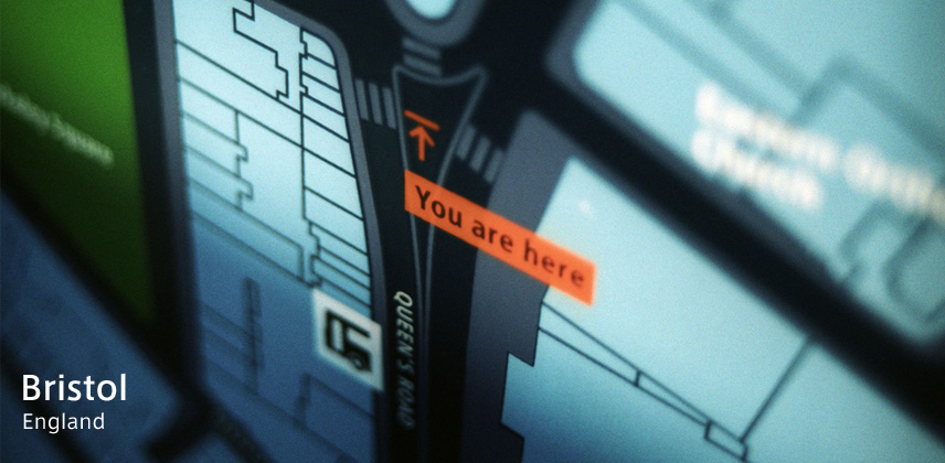
Placed at the distance of 170km west from London, Bristol is the city with a most many population in the southwest area of the England. In the WW2 Bristol was bombarded hardly, then the center area of the city was cut off in the reconstruction era. So the appearance of the city is hard to be understood.
Because of that, in 1998 Bristol had started up the project called "Bristol Legible City" to re-design the illegible city into legible totally. This project was proposed originally by Mr. Mike Rawlinson of the City ID, based on Bristol. The City ID designs the flow between choosing informations to be send and recieving of information, and develops the tool to convey the infromation from various sight of view such as city planning, information design, graphic design, branding.
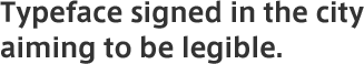
As one of the mesures, in 2000 the sign system for Bristol was completed to establish, and the original typeface was developed for "Bristol Legible City". The typeface was named "Bristol Transit" and now used not only for the sign system but also for the map panels on the road and guide maps. The typeface contributes to the city identity of Bristol to be legible.
"Bristol Transit" is designed basing on the "Transit", dedicated to the Berlin metro. Basing narrow typeface, it prevents unreasonable transformation of letters with a function of graphic software in a situation such as the sign system to fit many letters in limited space.
Furthermore, the approach to make original typeface in the project "Bristol Legible CIty" is carried on by Seoul metropolitan city of Korea aiming asian design city.
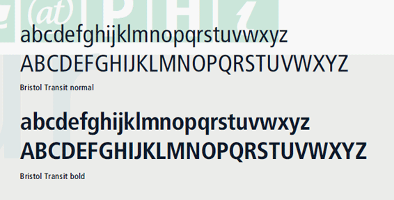
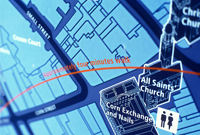
Photo by rbrwr
| Released | 2000 |
|---|---|
| Name of typeface | Bristol Transit |
| Produced by | CityID/Meta Design |
| Related links |