


Photo by vengomatto

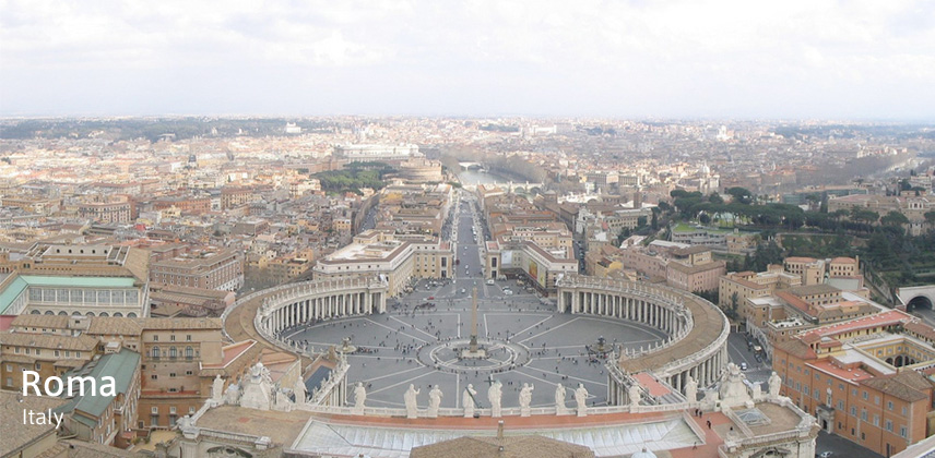
Rome was planned to make the sign system for the Christians worshippers in saint Millenium, 2000. The project was started up mainly by the arrangement comittee of the great holy year, based on the Vatican. By the competition, Mr. Gerald Unger of Netherland got to design the typeface.
The typeface for Rome was named "Capitolium", based on the manuscript of Giovanni Francesco Cressi, a secretary of Cathoric Christian Church in 16 century. Manuscripts of Cressi was choosen because he is the first person in the history to write about typical trajan epitaphs of ancient Rome era, many common points are found between the manuscripts of Cressi and the trajan epitaph, and Cressi left not only the upper cases of the Alphabet but also the lower cases. In many epitaphs there are no lower cases, so it's hard to design the typeface basing on the epitaphs. Mr. Gerald Unger solved the problem by basing on the manuscripts of Cressi.
Mr. Unger tried to apply the Cressi's scripts to a sans-selif style typeface to use as a face for signs, but it was rejected by himself because the shape and atmosphare of the prototype typeface was not suitable for nature of Rome, so he re-designed the typeface in selif style. (The proto-type was renamed "Vesta" later and now can purchase from his site.)
At first the typeface was planned to be used as a face for signs, but the use in other media was considered later. Finally he made the faces for body text: Capitolium Light, Regular, Italic, Bold, and the face for sign: Capitolium Road. Capitolium Bold has the feature of a narrower width and a higher X-height.
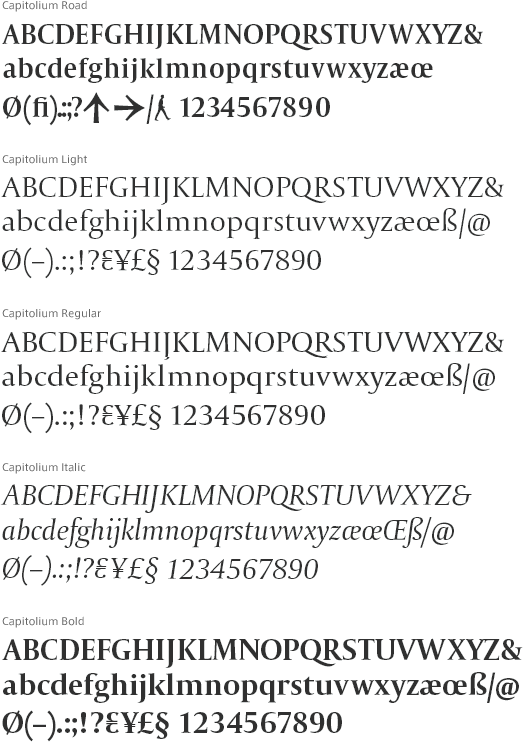
Photo by strife
| Released | 1998 |
|---|---|
| Name of the typeface | Captolium |
| Produced by | Gerard Unger |
| Related links |