


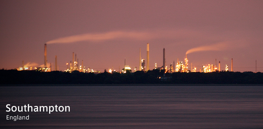
Photo by Nicholas R Horne
From 2006, The eminent port town of the England, Southampton is going on the project to make the city identity for 20-year-ahead future. In a masure of the project, the City ID, handled the similar project in Bristol, is designing the sign system of the city and guide maps. In the project lead by City ID they approach the goal of sign system with making the original typeface of the city. The typeface is produced by Dalton Maag, a design studio in London.
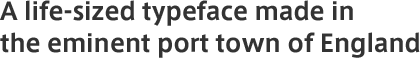
The typeface made for Southampton consists of the face for heading: Display, the faces for body text: Regular, Medium and Bold. "Display" has the motif of rigid container of the port in detail and framework of the typeface, so the nature of the city can be felt. On the other hand the faces for body text - Regular, Medium and Bold - have also the motif of containers on the ports, and have more legible detail. Some test was performed to destinguish the letters each other in the development process. Tests are done at the University of Reading which has a curriculum of typeface, and at the national institute for the blind.
In this project, besides the typeface the pictogram for the signs and maps of Southampton was made at same time. The combination of the original typeface and pictogram will get the roll of icon for Southampton in long-term use.
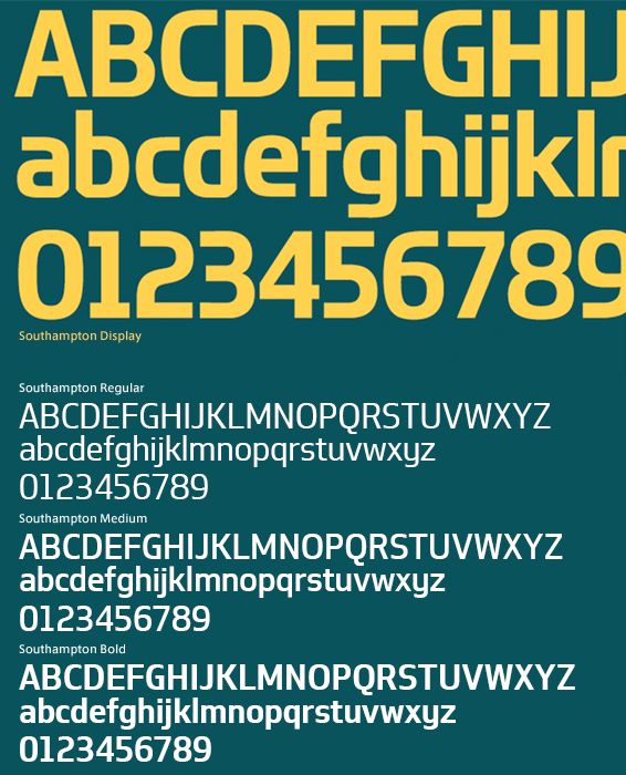
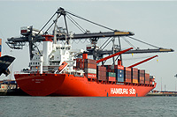
Photo by dazzy1960
| Released | 2008 |
|---|---|
| Name of the typaface | Southampton |
| Produced by | CityID/Dalton Maag |
| Related links |